
演習問題
Contents
演習問題#
![]()
演習問題です。
import numpy as np
import matplotlib.pyplot as plt
import pandas as pd
# 日本語対応
from matplotlib import rcParams
rcParams['font.family'] = 'sans-serif'
rcParams['font.sans-serif'] = ['Hiragino Maru Gothic Pro', 'Yu Gothic', 'Meirio', 'Takao', 'IPAexGothic', 'IPAPGothic', 'VL PGothic', 'Noto Sans CJK JP']
df = pd.read_csv('sample_data/california_housing_train.csv')

print(df.head(5))
   longitude  latitude  housing_median_age  total_rooms  total_bedrooms  \
0    -114.31     34.19                15.0       5612.0          1283.0
1    -114.47     34.40                19.0       7650.0          1901.0
2    -114.56     33.69                17.0        720.0           174.0
3    -114.57     33.64                14.0       1501.0           337.0
4    -114.57     33.57                20.0       1454.0           326.0

   population  households  median_income  median_house_value
0      1015.0       472.0         1.4936             66900.0
1      1129.0       463.0         1.8200             80100.0
2       333.0       117.0         1.6509             85700.0
3       515.0       226.0         3.1917             73400.0
4       624.0       262.0         1.9250             65500.0
# カリフォルニアの気象データ

california_temp = pd.DataFrame(
    {
        "month": [1, 2, 3, 4, 5, 6, 7, 8, 9, 10, 11, 12],
        "average_temperature": [10.7, 11.8, 13.0, 13.9, 15.4, 16.9, 17.7, 18.2, 18.2, 16.9, 13.4, 10.7],
        "precipitation_amount": [98.8, 100.2, 69.4, 35.2, 13.3, 3.8, 0.0, 1.0, 1.9, 20.0, 50.3, 105.9],
    }
)

california_temp
| month | average_temperature | precipitation_amount | |
|---|---|---|---|
| 0 | 1 | 10.7 | 98.8 |
| 1 | 2 | 11.8 | 100.2 |
| 2 | 3 | 13.0 | 69.4 |
| 3 | 4 | 13.9 | 35.2 |
| 4 | 5 | 15.4 | 13.3 |
| 5 | 6 | 16.9 | 3.8 |
| 6 | 7 | 17.7 | 0.0 |
| 7 | 8 | 18.2 | 1.0 |
| 8 | 9 | 18.2 | 1.9 |
| 9 | 10 | 16.9 | 20.0 |
| 10 | 11 | 13.4 | 50.3 |
| 11 | 12 | 10.7 | 105.9 |
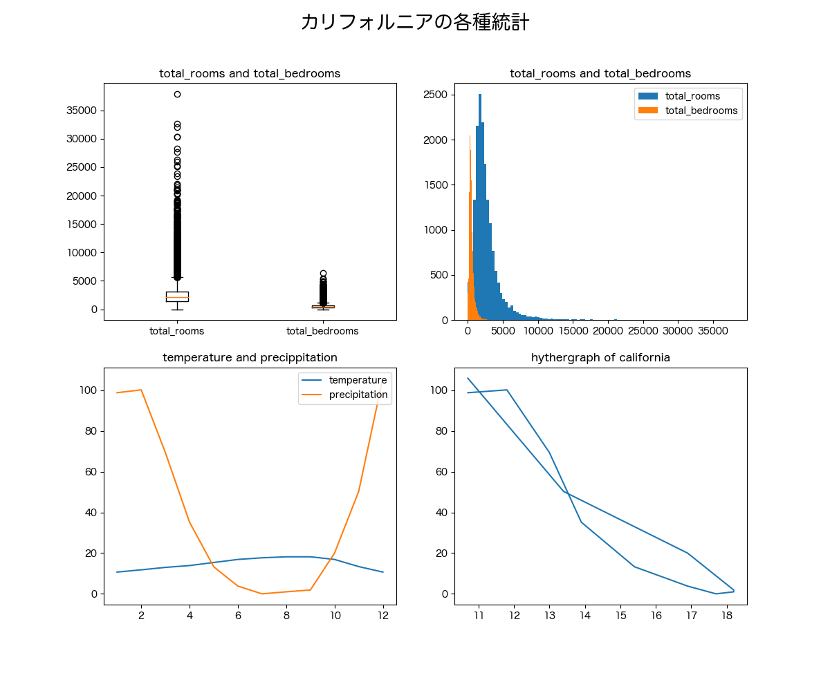
課題#
穴埋めで、下の図を完成させよう。
左上に
df['total_rooms']とdf['total_bedrooms']の箱ひげ図をプロット右上に
df['total_rooms']とdf['total_bedrooms']のヒストグラムを重ねてプロット
bins=100を指定すること左下にカリフォルニアの雨温図をプロット
(横軸:月, 縦軸:気温、降水量の折れ線グラフ)右下にカリフォルニアのハイサーグラフをプロット
((x, y) = (気温, 降水量)のグラフ)
↓こんな感じ
### 問題 ###
# ... に当てはまるコードを入れてね

fig = plt.figure(figsize=(12, 10), dpi=100)

ax1 = ...
ax2 = ...
ax3 = ...
ax4 = ...

# ax1 (左上)
ax1. ...

# ax2 (右上)
ax2. ...  # label='total_rooms'
ax2. ...  # label='total_bedrooms'
ax2.legend(loc='upper right')

# ax3 (左下)
ax3. ... # label='temperature'
ax3. ... # label='precipitation'
ax3.legend(loc='upper right')

# ax4 (右下)
ax4. ...

#### タイトル
fig.suptitle('カリフォルニアの各種統計', fontsize=20)

ax1.set_title('total_rooms and total_bedrooms')
ax2.set_title('total_rooms and total_bedrooms')
ax3.set_title('temperature and precippitation')
ax4.set_title('hythergraph of california')

plt.show()
  Input In [5]
    ax1. ...
         ^
SyntaxError: invalid syntax
解答#
解答
fig = plt.figure(figsize=(12, 10), dpi=100)

ax1 = fig.add_subplot(2, 2, 1)
ax2 = fig.add_subplot(2, 2, 2)
ax3 = fig.add_subplot(2, 2, 3)
ax4 = fig.add_subplot(2, 2, 4)

# ax1 (左上)
ax1.boxplot((df['total_rooms'], df['total_bedrooms']), labels=('total_rooms', 'total_bedrooms'))

# ax2 (右上)
ax2.hist(df['total_rooms'], bins=100, label='total_rooms')
ax2.hist(df['total_bedrooms'], bins=100, label='total_bedrooms')
ax2.legend(loc='upper right')

# ax3 (左下)
ax3.plot(california_temp['month'], california_temp['average_temperature'], label="temperature")
ax3.plot(california_temp['month'], california_temp['precipitation_amount'], label="precipitation")
ax3.legend(loc='upper right')

# ax4 (右下)
ax4.plot(california_temp['average_temperature'], california_temp['precipitation_amount'])

#### タイトル
fig.suptitle('カリフォルニアの各種統計', fontsize=20)

ax1.set_title('total_rooms and total_bedrooms')
ax2.set_title('total_rooms and total_bedrooms')
ax3.set_title('temperature and precippitation')
ax4.set_title('hythergraph of california')

plt.show()